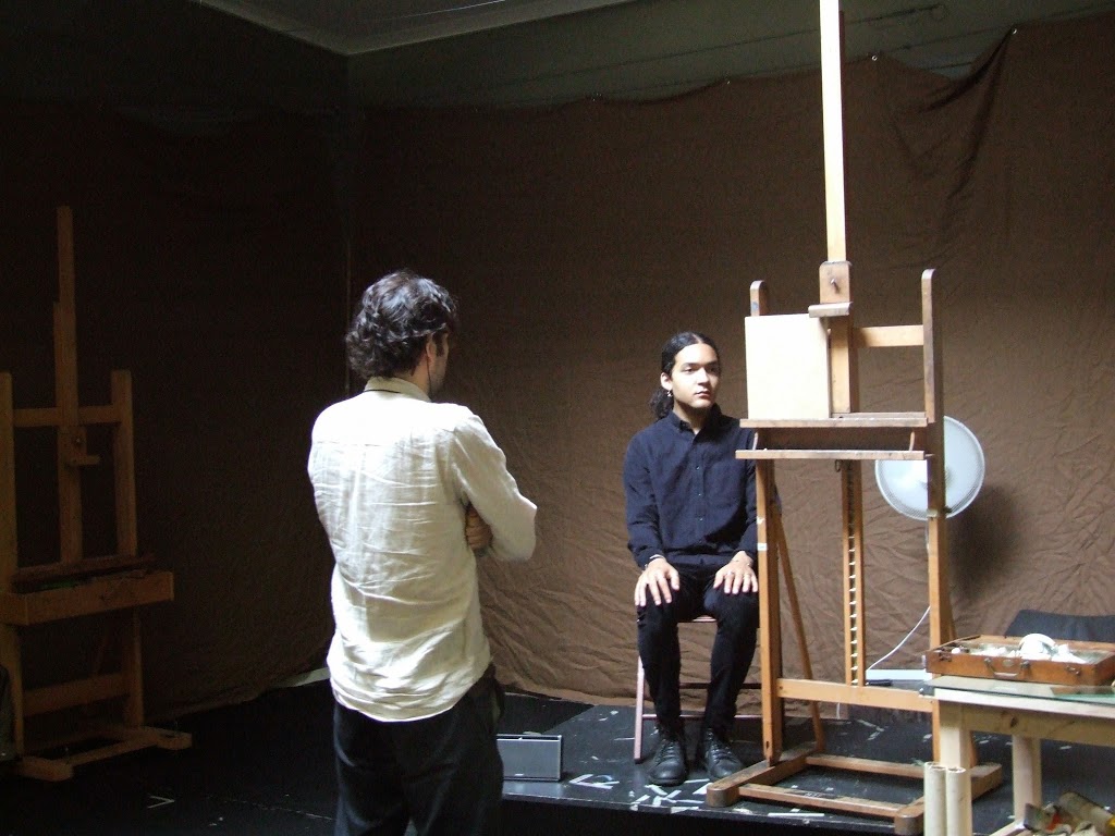
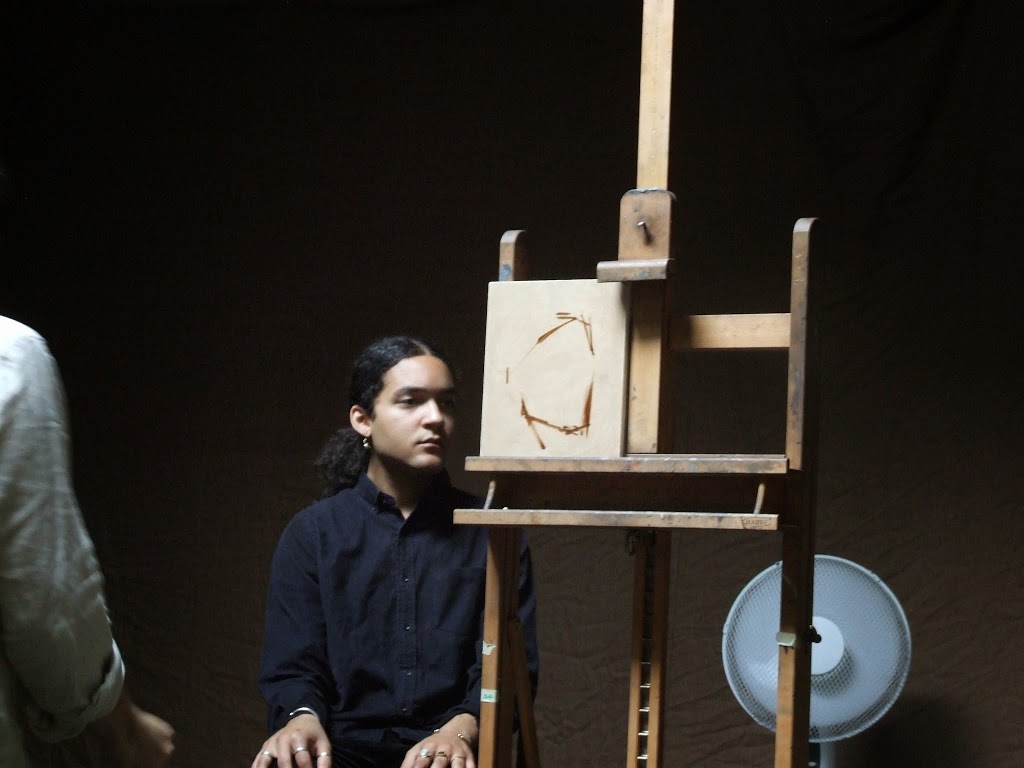
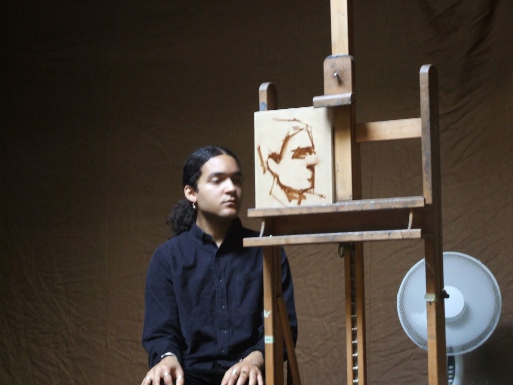
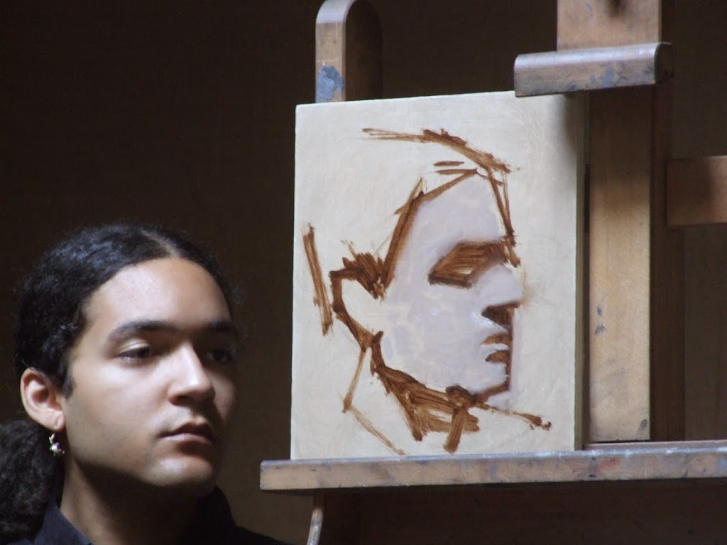
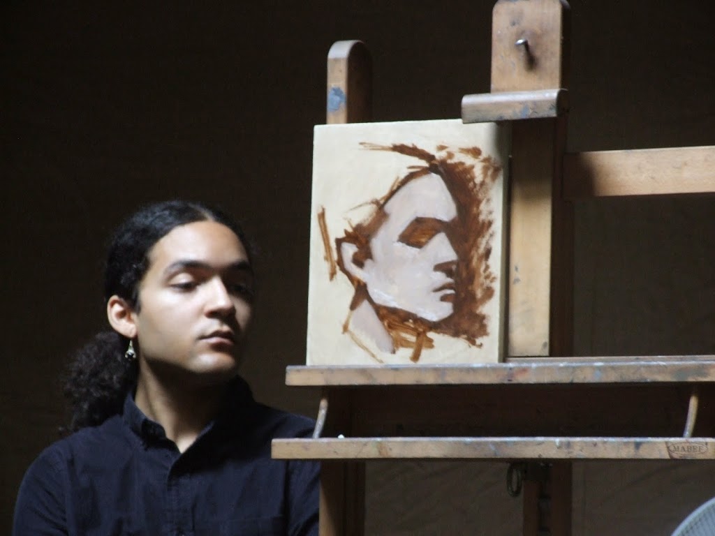
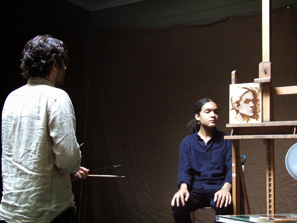
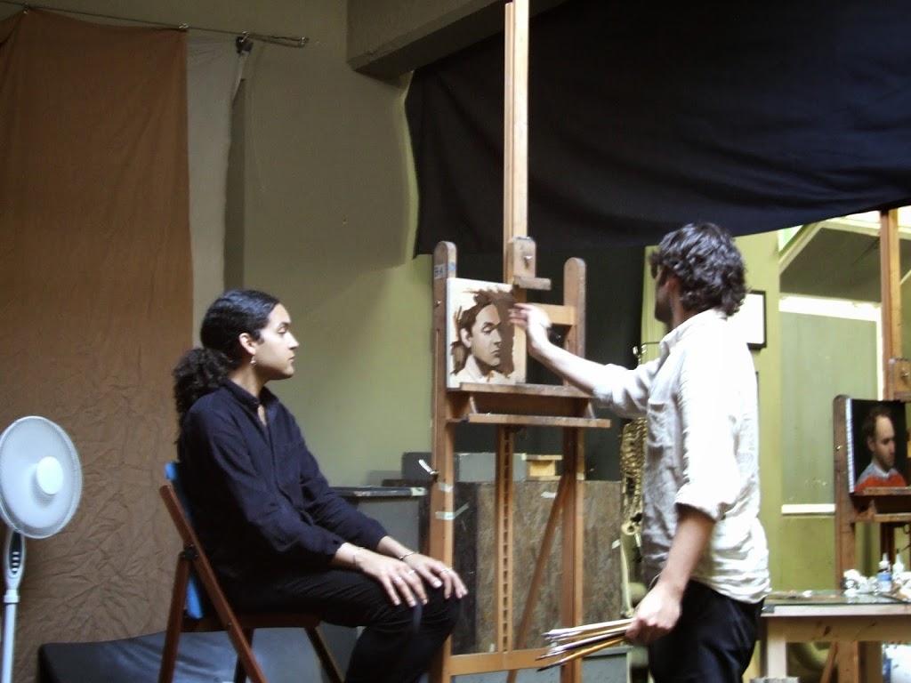
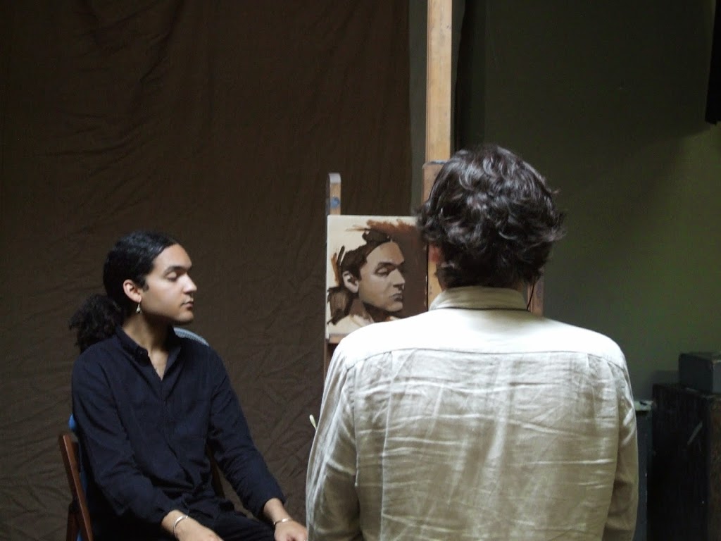
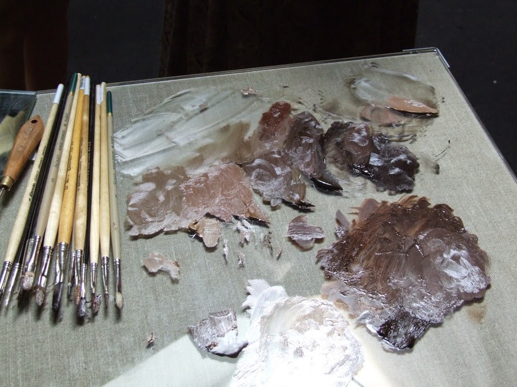
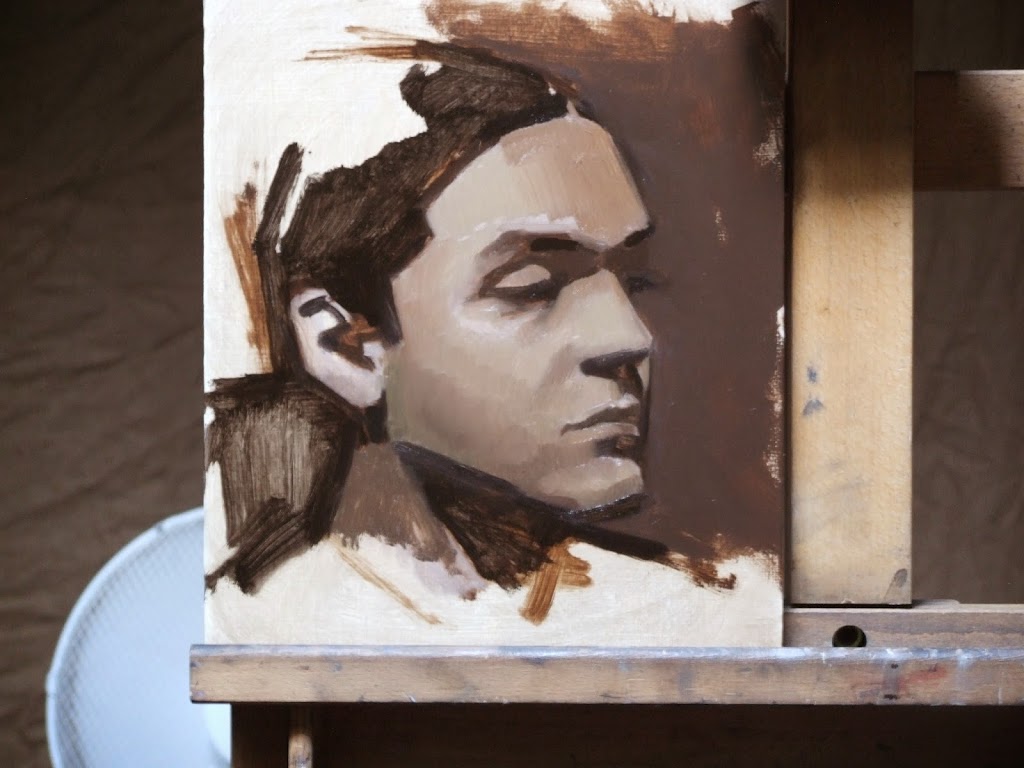
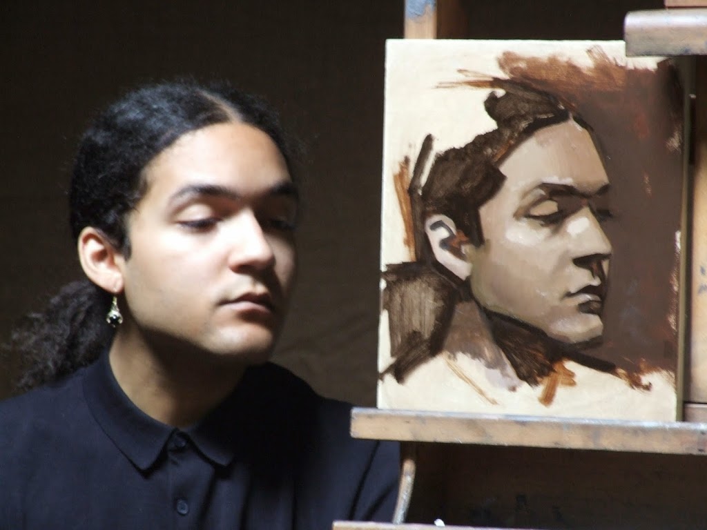
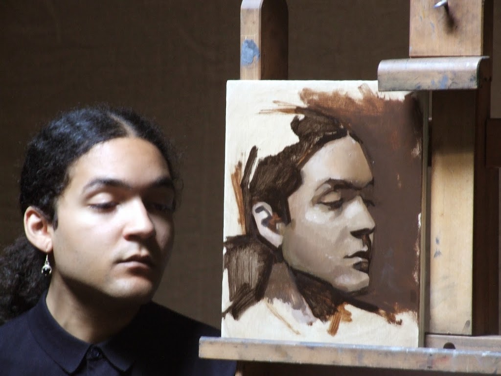
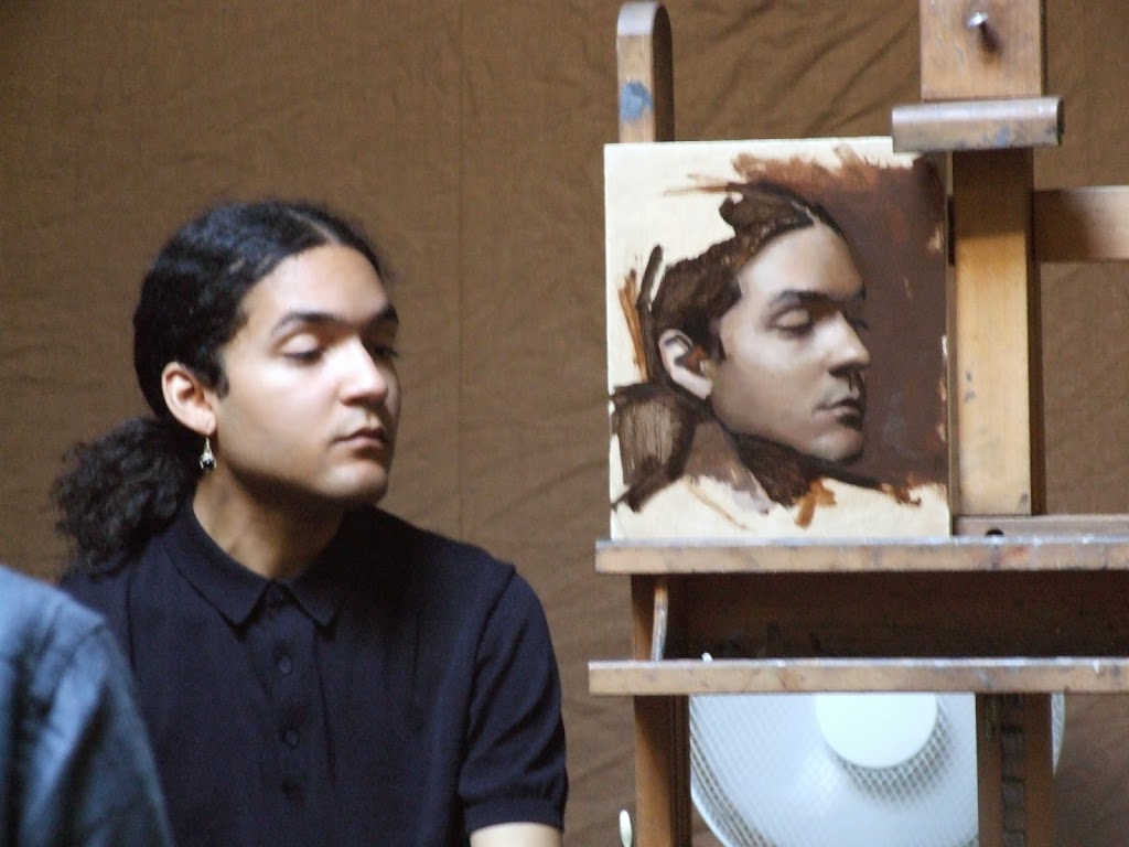
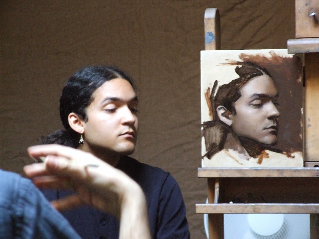
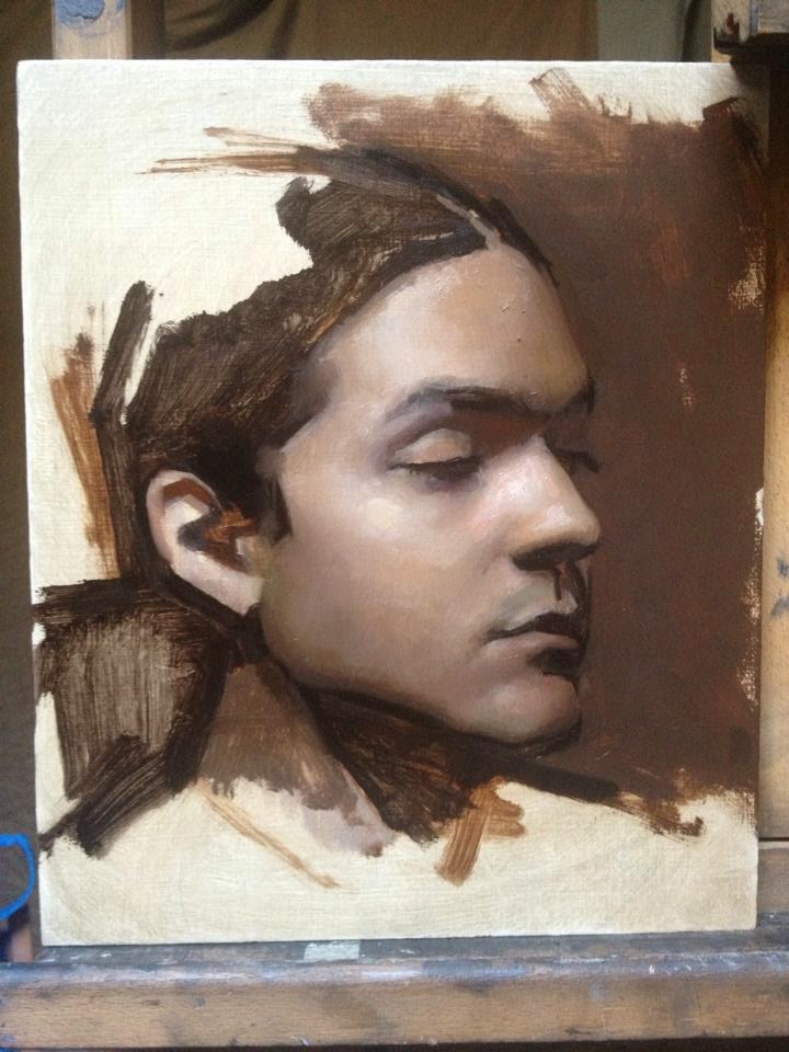
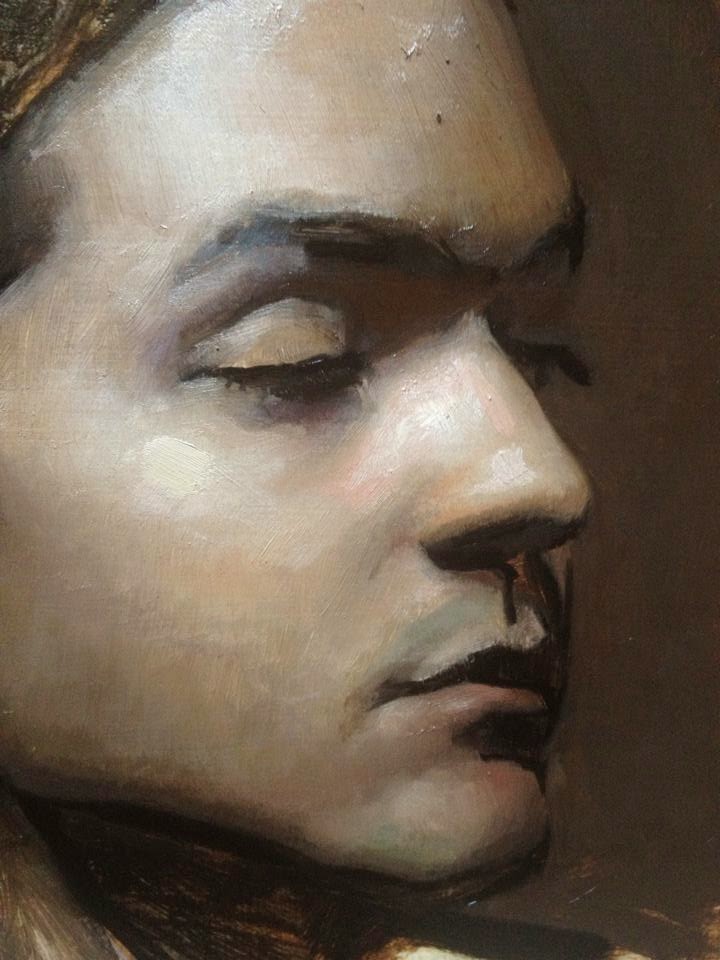
Photos from the Jordan Sokol demo at FAA, Sweden
Can't believe it's been a week already since Jordan Sokol did a two-day portrait demo at the Florence Academy of Art, Sweden, which I attended. (I will just get these photos up and add some commentary later.)
Day 1 (24/5/14)
During the block-in stage Jordan discussed the various online sources for quality information on materials, and artists who are worth reading or listening to about the subject. These included the suggested donation podcast, Ralph Meyer of course, Ted Minoff, George O'Hanlon of natural pigments and the National Gallery bulletin amongst others. The artist Dan Thompson also came up in reference to drawing.
"Draw first - measure second." A comment I found valuable.
Hog bristle brushes can be used to cover large areas quickly. Mongoose bristle brushes were also cited as a further choice for their delicate yet stiff quality.
Again, unfortunately a lot of the colours, shapes and edges are lost in the photograph.
________________________________________________________________________________
Day 2 (25/5/14)
A retouch varnish can be applied to a dry-to-the-touch painting in order to begin working on it again. The shapes are worked on taking them from an abstract, or perceptual, to a more conceptual form - meaning the shapes - as they are understood as well as are observed - are considered in design. In going towards this more conceptual design the advice was given to draw what you see - not what you know - but know what to look for.
In the discussion on painting Jordan mentioned a quote from Philip Guston which reads "When you're in the studio painting, there are a lot of people in there with you - your teachers, friends, painters from history, critics... and one by one if you're really painting, they walk out. And if you're really painting YOU walk out."
